Transportation Payment Project
This was a project for DSGN 1 at UCSD. We were tasked with finding some task where we often experience difficulties to look into. In that process, I interviewed people about the transportation payment process and analyzed that data with hopes of created some redesign.
Choosing the project
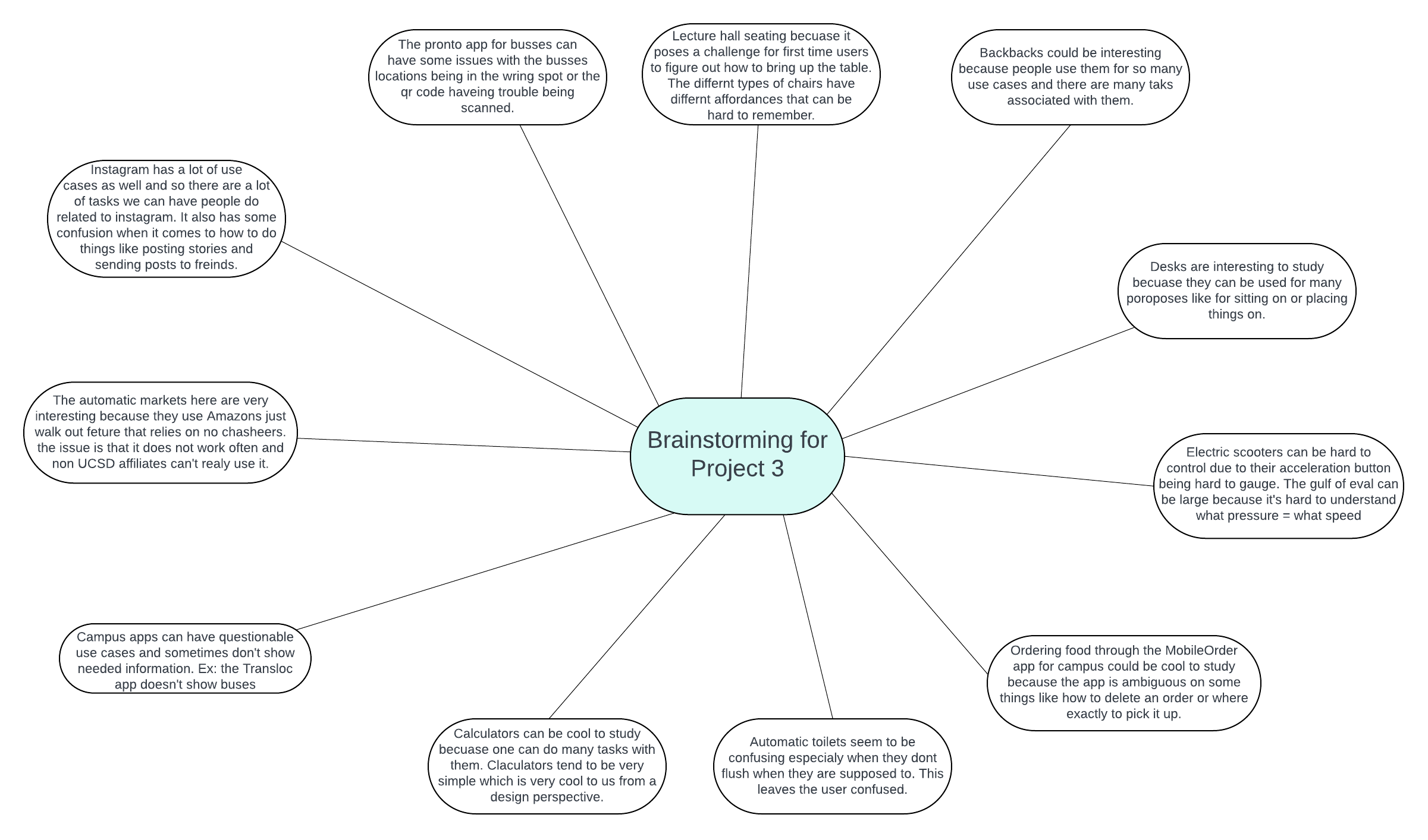
Prior to choosing the projects topic, we brainstormed what we wanted to focus on. I wrote down the ideas we discussed on this document on lucid charts. We ultimately decided on the transportation payment process. We brought up that particularly in San Diego, the app Pronto can be used for transit, however, the QR code it provides for paying often is difficult to scan. This provided us with a task that we have personally had issues with in the form of both mistakes and slips.
Interviewing
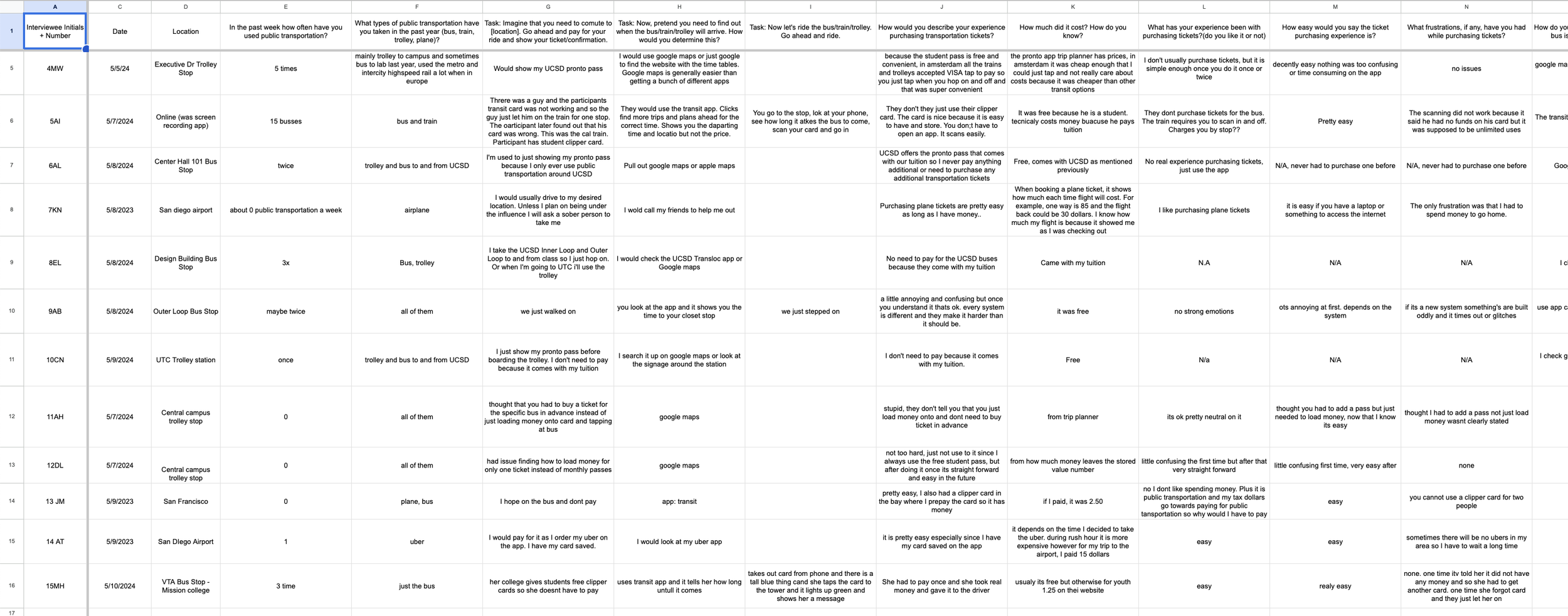
Seeing as we wanted to study transportation payment processes we interviewed people near busses, trains, and trolleys and prompted them to ride that form of transportation. I had a trip planned during the project and so I also interviewed people using bus and train systems in the Bay Area. This gave us a wider range of payment methods that we could analyze. We asked the people in our many questions ranging from how often they use public transportation to asking them to show us how they pay for and ride the bus, trolley, or train. We also observed our participants as they performed these tasks and wrote notes on what they did.
Analysis
I looked through the data we collected and found some main themes. I will begin by going through some of the descriptive statistics we collected followed by some successes and errors we observed. These graphs and insights were created by me and one of my teammates.
As you can see, most of our participants were interviewed about their experience with the bus, followed by the trolley and the train. This makes sense considering a majority of our interviews were in San Diego on or near UCSD. These participants mainly used a QR code, as that is how UCSD students can ride free transportation. Other than a QR code, we also interviewed people who were using a card, ticket, or tap to pay.
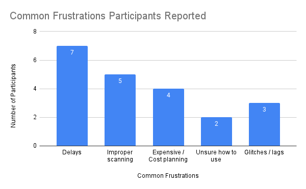
The most common frustration that participants reported to us was that the bus would often arrive late. Another frustration that was common was that QR codes were often hard to scan and took users some adjustments to use. This was followed by the frustration of cost or transportation and glitches in the transportation apps. These frustrations were all taken into account.
As mentioned prior issues scanning the QR code was the most prevalent issues that we saw people encounter. Particularly, this was seen in 5 of our 8 participants who used a QR code. In most cases it seemed like the person’s screen brightness was off or they angled their phones incorrectly.
Another interesting insight was that at least 4 of our interviewees admitted that they had rode the bus, trolley, or train without paying for their ticket when they should have. In some cases this was a mistake, but in other cases people reported forgetting their card but still needing to ride. Specifically, 2 of 5 card users recalled forgetting their card.
Successes:
Free transportation: 3 of our participants were interviewed on the UCSD busses which are free and noted that this made riding the bus way more convenient as they did not have to worry about payment.
Tap to pay: A participants we interviewed raved about tap to pay as an easy way to pay for the bus due to its narrow gulf of execution.
Indication of payment: 4 of our participants specifically mentioned that a visual and audio indication of the payment going through was helpful and convenient.
Design Spaces
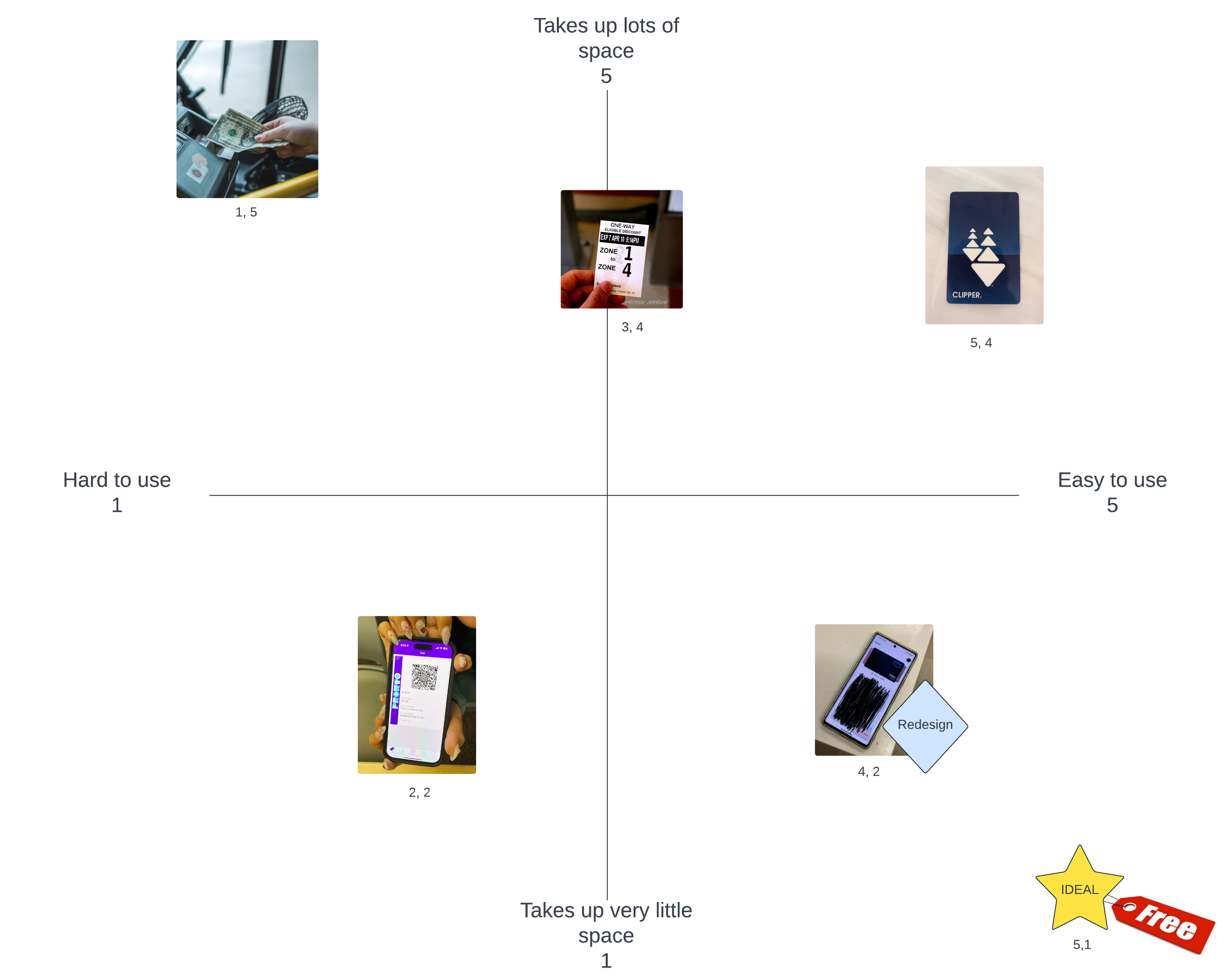
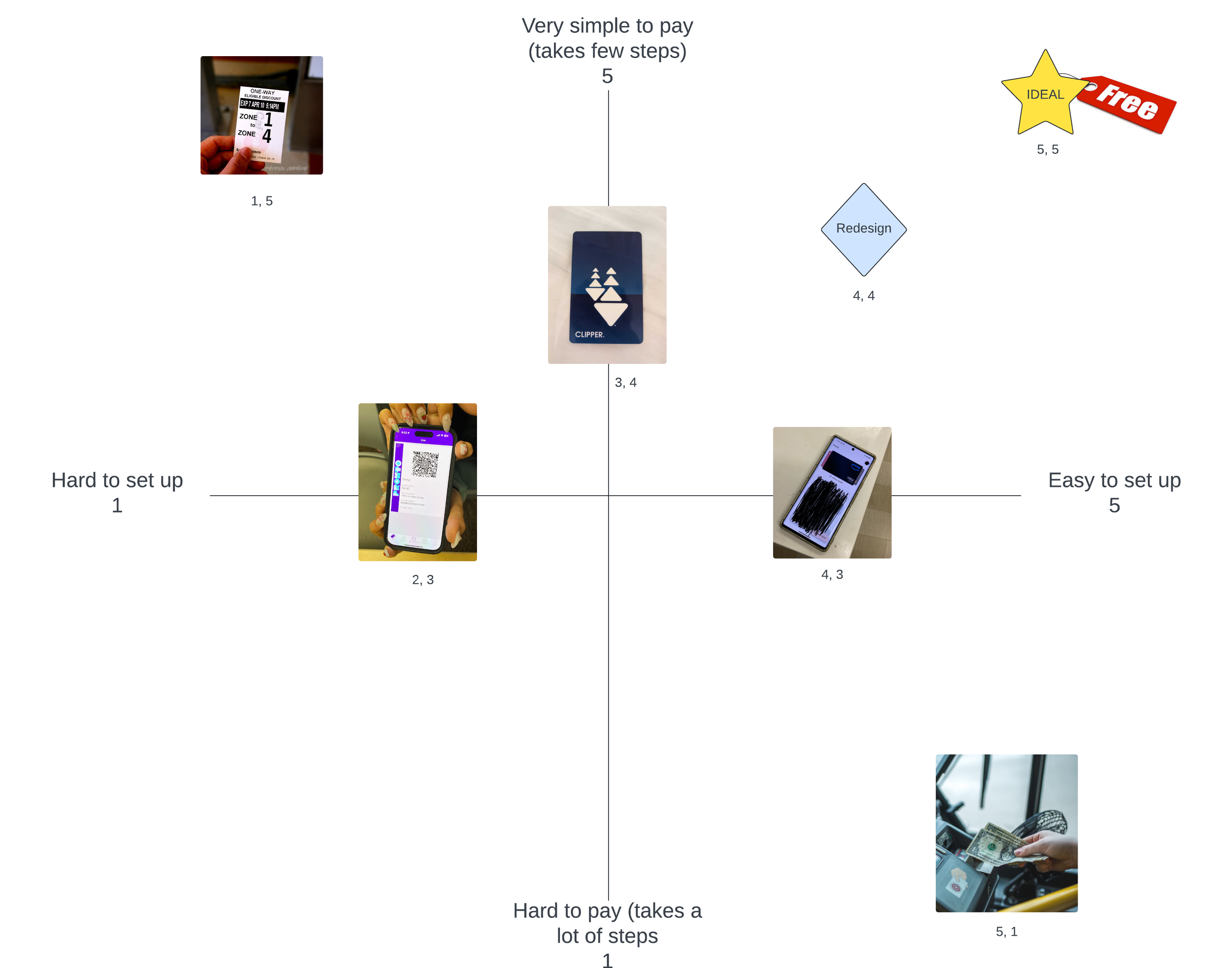
In noting the tradeoffs we observed, we created design spaces that we could use to visualize our tradeoffs. Below are our two tradeoffs. I created the design spaces on lucid charts. You will notice that our redesign is also on these graphs although this was added after the fact.
Materiality vs Ease of Use
This tradeoff is that of the physical nature of the item versus the ease of using the item to pay. We found that with cards being a physical item people tended to forget them often. This is despite the fact that these were way easier to use than a QR code on a phone as they could easily be tapped on the reader.
Set Up vs Simplicity
This tradeoff examines how the time it takes to set up the payment method related to how many steps it takes to use the payment method.
Redesign
Our redesign is an app that allows users to tap to pay to pay for transportation services. This would integrate with Google and Apple wallet to be seamless with peoples phones. Along with that, a free card would be offered to all users which they can use to pay instead. I created the mockups of the design on figma.
This is the profile page of the app. It allows users to pay for a transit subscription such that they won’t have to worry about the amount of money in their account. This would seamlessly integrate with the app and allows for easy use. This should make users feel as though they are getting more value out of their transportation pass and eliminate thoughts about paying for the bus, trolley, or train.
To view the whole prototype click on the button below.


